







Best Ways to Visualize Weather Data for Personal Projects
by Doug Analla
by Doug Analla
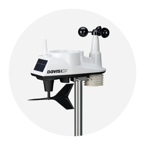
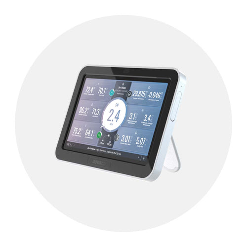
Weather data becomes far more insightful when you can see it. Whether you’re running a personal weather station, exploring public datasets, or building a science fair project, effective weather visualization turns numbers into understanding. This guide covers what to plot, how to plot it, the best tools for visualising meteorological data, and the techniques to display real-time weather updates on a website. It highlights Davis Instruments and WeatherLink as trusted options for a weather data service, and shows the best ways to visualize weather data for personal projects using reliable, high-quality data from weather data services.
Weather visualization helps you spot patterns, test forecasting ideas, and communicate results. With charts, you can link a pressure drop to a passing front, compare microclimates around your home, or show how a storm evolved over an afternoon. Visuals also make it easier to explain findings and answer practical questions like how can we predict the weather from local signals or use data for weather forecasting at home.
Start by clarifying your primary goal. Are you telling a story about a single event, analyzing long-term trends, monitoring real-time conditions, or building an archive for ongoing study?
Data quality shapes every chart. Consider sampling frequency—1-minute data captures short-lived gusts that 15-minute logs might miss. Calibrate sensors and record maintenance dates; relocating a rain gauge or changing radiation shielding affects readings. Plan for missing data from power or connectivity issues and handle gaps explicitly so dropouts aren’t misread as calm, dry, or steady conditions. High-quality weather data services such as Davis Instruments’ WeatherLink help ensure dependable streams that make visualization more accurate and support data for weather forecasting.
Different variables benefit from different visual forms:
Temporal versus spatial data influences layout. Time series show how conditions evolve at one location. With multiple sensors, spatial techniques—heatmaps, interpolated contours, or pin maps—reveal microclimates. For broader datasets, maps with graduated symbols or tiled backgrounds provide instant geographic context and support local forecasting questions about how can we predict the weather for your area.
Derived metrics turn raw numbers into intuitive signals. Plot dew point alongside temperature to show comfort and cloud potential. Use shaded overlays for wind chill or heat index. Show precipitation accumulation as a cumulative line and intensity as short-interval bars to catch downpours. Clearly label formulas so viewers understand how derived values were calculated and how they relate to data for weather forecasting.
For trend detection, start with time series. Apply moving averages or rolling medians to reduce noise without hiding meaningful events—5 to 15 minutes for real-time charts, and 24 hours to 7 days for longer studies. Use multi-series overlays to compare variables (for example, temperature vs. dew point or wind speed vs. pressure), but keep lines manageable with distinct colors and styles.
Maps, contour plots, and heatmaps highlight spatial patterns. A gridded temperature heatmap across a yard can show sun-exposed versus shaded areas. Contours help with pressure or elevation-driven variables if you have enough sampling points. For broader views, tile maps with layers for radar, station locations, or isobars add context.
Specialized visuals elevate interpretation. Wind roses summarize wind direction and speed distribution. Hyetographs show rainfall rate over time for storm analysis. Seasonal polar diagrams plot variables by day-of-year and time-of-day on a circular axis to reveal recurring patterns.
The best tools for visualising meteorological data include:
How to display real-time weather updates on a website:
Standardize formats early: unify timestamps to UTC or a consistent local time with recorded time zone, and store units explicitly (°F, mph, inHg). Clean data before plotting: remove or flag impossible values, convert units, and resample to consistent intervals. Aggregate thoughtfully—1-minute samples capture gusts for wind analysis, while hourly means suit daily trends. For rain, sum for accumulation and compute rate separately.
Workflow choices improve reliability. Match sampling cadence to your goal—faster for convective weather, slower for seasonal studies. Mark gaps as missing rather than filling with zeros; if you must fill, use forward-fill or interpolation cautiously and document the method. Apply smoothing for clarity but keep a raw series visible for transparency. Maintain reproducible notebooks with versioned code and data snapshots so results can be regenerated and audited.
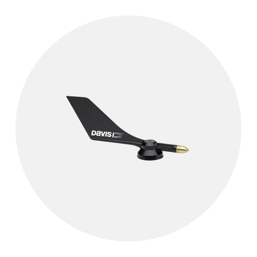
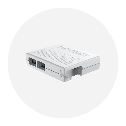
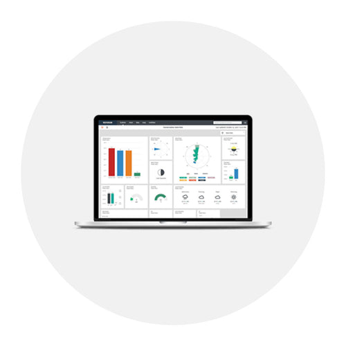
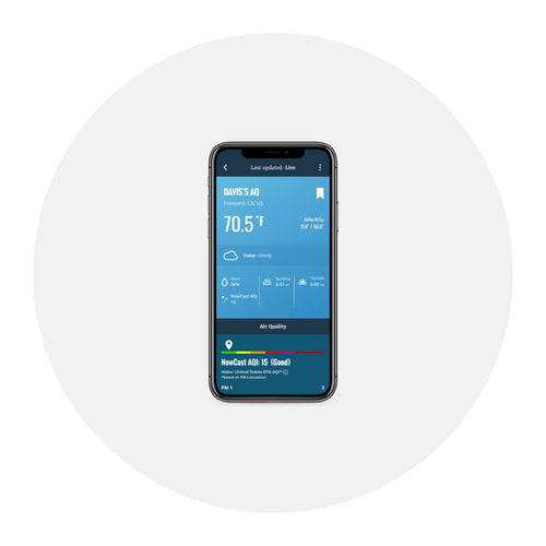
Design turns charts into comprehension. Use colorblind-friendly palettes, label axes with units, and keep ticks readable. Provide context with annotations for sensor maintenance, station relocation, or weather advisories so viewers don’t confuse instrument artifacts with climate signals. Share via WeatherLink.com, WeatherLink, and Mobilize apps, embed interactive charts on web pages, and export static images for reports and social posts. Davis Instruments pairs rugged hardware with cloud tools that support accurate weather visualization and just-in-time insights for everyday decisions, making these the best ways to visualize weather data for personal projects with dependable data for weather forecasting from a proven weather data service.